Legends You Can Actually Read: Picking Keycaps for Real Desks and Real Lighting
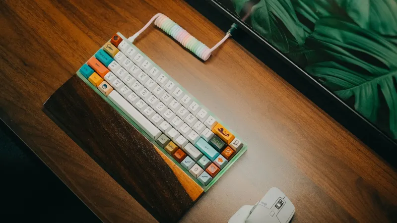
Keycap shopping has a photography problem. The hero shot is a top-down angle in warm, diffused light, taken before anyone's fingers have touched the set. Then you install it on your desk, where the ceiling is a bank of 4000K LED panels, your monitor is blasting white spreadsheets, and there's a window behind you doing unkind things to a matte surface.
The gap between the photo and the desk is where most keycap regrets live. Here's how to close it.
Contrast Is a Spec, Not a Vibe
The single biggest factor in whether you can read your board at a glance is legend-to-cap contrast. Not the colorway, not the brand, not the price. Contrast.
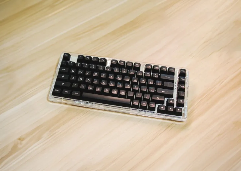
Dark legends on light caps read well in almost any lighting. Light legends on genuinely dark caps also work, provided the cap is dark enough to be a real background rather than a moody gray haze. The sets that fail are the fashionable middle: charcoal-on-black, beige-on-cream, muted taupe on taupe. They photograph beautifully and then vanish under a glare source at four in the afternoon.
If you type in a room with overhead lighting and a window, aim for a clear tonal jump. Anything under a subtle difference is a design choice you'll be living with rather than admiring.
Legends: How They're Made Matters More Than You Think
Doubleshot legends are molded from two plastics, so they're crisp and they don't wear off. Dye-sublimated legends are printed into the surface of PBT and are extremely durable in their own right. Pad-printed legends are the ones to avoid if the board gets daily use, because that's the ink that fades out on the E, S, and D within a year.
Then there's placement. Top-printed legends are the default and the easiest to scan. Side-printed sets look wonderfully clean from above but force you to tilt the board to find a symbol, which gets old during a deadline. Blank caps are an aesthetic commitment, not a productivity strategy, unless you already touch-type without looking and have for years.
Shine-through legends only matter if you're running a backlit board. If you're not, paying extra for translucent caps gets you a slightly thinner keycap and a glow you'll never see. And on a backlit board in an office, fully lit keycaps plus RGB tend to read more gaming station than grown-up desk. A subtle single-color backlight with shine-through legends is the version that survives a conference room.
PBT Versus ABS: The Shine Question
The classic split. PBT is denser, has a subtle texture, resists the oils in your fingertips, and tends to produce a lower, more muted sound. ABS is smoother, often sounds a little brighter, and takes rich, saturated colors more easily. Both are legitimate. The deciding factor for most people is what happens at month twelve.
ABS polishes. Type eight hours a day and the spacebar, the E, the S, and the D develop glossy patches where your fingers live. Some people love that worn-in look. Most people who bought a set for a tidy desk do not. PBT's texture holds its grip and its matte look far longer, which is why it's the safer bet for a work board.
Quality matters more than the letters, though. A thick, well-made ABS set can sound terrific and last years; a thin, hollow PBT set can sound like a plastic cup. And a growing number of 2026 sets use coatings and molding tweaks aimed at slowing shine on ABS, which is worth reading about but not worth trusting blindly.
One practical note: dye-sublimation is a PBT process. If you want intricate multicolor legends on ABS, you're mostly looking at doubleshot, which limits how fussy the artwork can get.
Profile Height and the Desk You Already Own
Keycap height changes how the board feels under your hands as much as how it sounds.
- Cherry and OEM profiles sit at a comfortable middle height with a gentle sculpt. They're the default for a reason.
- SA and other tall, sculpted profiles look spectacular and sound deeper, but they raise your hands noticeably. If your board already sits at a steep angle, you may find yourself wanting a wrist rest you didn't need before.
- XDA and DSA are uniform and flat-ish, which makes them easy to rearrange across rows and pleasant for light typing. Uniform height also means no sculpted guidance, so some people type slightly more hesitantly.
- MT3 and KAT-style sculpts offer deep dishes and pronounced shapes that some typists swear by and others find distracting for an hour.
Taller profiles also leave more air inside the case, which tends to amplify sound. In an open office or a shared apartment, that's worth factoring in before you fall in love with a high-profile set.
Colorways That Survive a Tuesday
A few practical filters:
- All-white and cream sets show skin oils and coffee splatter immediately.
- Pure black PBT turns into a dust and crumb display case under a desk lamp.
- Very light gray on white is basically a low-contrast set with better marketing.
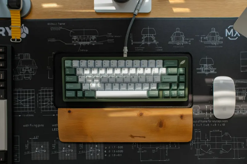
What tends to hold up: warm gray, navy with cream legends, forest or deep green, and the evergreen white-on-black and black-on-white combos. These read cleanly, hide minor wear, and don't fight whatever your desk mat is doing.
Match the set to the room, not the feed. If your desk is a light wood with a gray monitor and a neutral mat, a soft gray or navy set will look intentional. A neon gradient will look like a visitor.
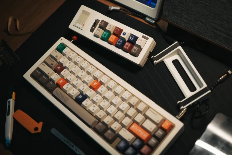
Novelties are fine. A couple of them, on keys you don't use under pressure, is a nice signature. A full novelty row is a conversation piece, and conversations are what happen instead of typing.
Compatibility, Before You Get Excited
Boring, essential. Check the bottom row of your board: 6.25u versus 7u spacebar, the width of the modifiers, and whether you need a 1.75u right shift for a 65 percent layout. Confirm ANSI versus ISO. Confirm the number of keys in the kit against the number of keys on your board, because a base kit built for a 60 percent will leave your function row naked.
And check your switches. North-facing LED boards can interfere with tall Cherry-profile caps on certain rows, producing a clack instead of a thock. If your board has north-facing sockets, read the compatibility notes before buying a sculpted set.
The Order of Operations
Identify your layout and bottom row. Decide how much shine you're willing to tolerate, which points you toward PBT or a thick ABS set. Pick a profile that matches your board angle and whether you use a wrist rest. Choose a colorway based on your actual lighting, not the product page. Then check stock: in-stock sets are abundant in 2026, and waiting eight months on a preorder is a hobby, not a purchase.
Do that and the set you install in November will still look deliberate next November, which is a longer run than most trend colors manage.